
Native iOS App
EcoBoost
Overview
For this project, my team and I had two weeks to identify an opportunity within a problem space that we determined, and select the platform for which to design an appropriate solution. In that time we created EcoBoost, an iOS app for people who care about saving the environment. The app aims to organize and centralize local opportunities for environmental conservation straight to users. We were able to present the project to a team of 'stakeholders' to demonstrate our app goals and positioning in a competitive landscape.
Skills
TOOLS
Team
Role
Screener Survey, User Interviews and Scripts, Affinity Mapping, Persona, Problem Statement, Competitive Matrix, Feature Prioritization, MoSCoW Mapping, Design Studio, Mid-fi Wireframes, Hi-fi Wireframes, Usability Testing, Presentation
Google Forms
Otter
Sketch
InVision
Keynote
Trello
Chavi Bornstein
Ranson Vorpahl
Kirya Goldfeder
UX Researcher
UX/UI Designer
The Challenge
For my team to identify an opportunity within a problem space that we determined, and select a platform for which to design an appropriate solution. For this we decided to examine how to make volunteer opportunities for environmental conservation more accessible to individuals who are interested.


The Solution
After interviews, synthesis, usability testings, and pivoting, my team created an iOS app for people who care about saving the environment.
EcoBoost brings users local opportunities for environmental conservation straight to them in a centralized location, so that doing their part for the environment can fit into their schedule and be more accessible to them.
Initial Hypothesis
“We believe that making environmental clean-up opportunities more accessible for busy, environmentally-conscious users, will increase the levels of participation in volunteer clean-ups. This will strengthen the connectivity with their communities and their local environments.”
Research
Once my team and I determined our initial user group, which was people interested in volunteering for environmental conservation opportunities, we created and sent out a short survey with the goal of finding out how people feel about environmental conservation and volunteering in general.
Survey
We surveyed 50 people regarding potential interest in environmental
conservation and volunteering:
44 Respondents had volunteered for something previously
39 Respondents considered themselves environmentally conscious
46 respondents rated their interest in environmental conservation from moderate to very high
Interviews
From the 50 respondents to our survey who met our target criteria, we interviewed 5.
We made sure to include people with diverse ages, lifestyles, and even one person who had not considered themself to be environmentally conscious but still rated their interest in conservation as high.
Insights
• Survey data showed that even individuals who did not consider themselves environmentally conscious were interested in the environment
• Respondents had only ever used tools/apps to measure their carbon footprint or track their energy consumption
• Survey showed that most respondents (72%) admitted to having some free time.
Insights
• 3/5 interviewees reside in the same relative area, yet they all mentioned participating in specific conservation opportunities of which the others did not mention being aware.
• All the previous opportunities had only been found from offline sources like community circulated fliers, newspapers, and even while out sailing.
• Everyone that we spoke to who had participated in local conservation opportunities.
Revised Hypothesis
“We believe that making opportunities for local environmental conservation more accessible for busy environmentally-conscious users will increase the levels of participation in local opportunities and events. This will strengthen their connectivity to local conservation and being environmentally conscious in their lives.”
Synthesis
We then used affinity mapping to synthesize the information that we collected in our interviews and finds trends that emerged to inform our decision making during the design process.

My teammate Ranson and me working on our Affinity Map
From the groups that we mapped, we decided to create “I” statements that would allow us empathize with our user and give us a better understanding of what we can do to solve their problem.
Some of these statements were:
-
“I'm too busy to spend a lot of time on environmental conservation”
-
“I had trouble finding opportunities for conservation near me”
-
“I would use/appreciate tools that will help me learn about opportunities for environmental conservation”
-
“I have only found opportunities for environmental conservation from offline sources”
-
“I try to be involved with the environmental conservation opportunities near me when I’m aware of them”
From the synthesis that we did, and the trends that emerged, we created a user persona for whom we could model the potential use or our app after.
Persona
Raya

Problem Statement
People are aware that environmental conservation needs to be addressed, but find it hard to identify ways to help out that are accessible to them. Raya finds it difficult to participate in local conservation opportunities, due to the lack of information available to her online.
How might we help her get the information she needs to participate in local efforts for environmental conservation?
Platform Selection
Because we now had a better understanding of who we were trying to create for, it also became much easier for us to confirm the platform that we wanted to create our product on for her.
We ultimately chose to design a native iOS app because:
-
We want the app to be personal to each user and save their preferences
-
Apple has a company recycling program that aligns with our brand, and appeals more to the philosophy of our users.
-
More Americans use Apple phones than Android and other phone brands. To appeal to a larger audience, we decided to first target iOS users
Feature Prioritization
Because we now had a better understanding of who our user is and what their need is and the platform we were creating for, it was time for us to decide the type of app that we would be creating for them.
As a group, we started by mapping out the features that we each thought would be important to include in our website and then we synthesized our individual ideas to create a MoSCoW map to rate the importance of each feature that we had come up with. We used the map to determine what would have the highest or lowest impact on Raya’s experience and what would require the most or least amount of effort on our end to create for them.

Our MoSCoW Map
At the end of our mapping and ideation session, we determined that Raya would benefit from an app that had personal user profiles to save preferences and track accomplishments, an events calendar to show users everything going on, a location filter to show our users opportunities closest to them, upcoming events so they can plan accordingly, RSVP functions so they can save opportunities that they are interested in, and visual incentives like measured accomplishments to show users the impact they were having with their volunteering.
Design
Once we had a general idea of the features we wanted to include in our app design, we performed a Design Studio exercise. By hypothesizing about what some pages and features could look like through several rounds of sketching and workshopping we were able to strengthen our design layouts to determine our most viable product based on our prioritized features.
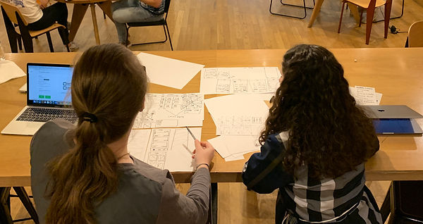
My teammate Chavi and me going over our team’s design studio sketches
Wireframe Design Progression and Usability Testing
We did some preliminary testing on our lo-fi paper prototype and then created our mid-fi wireframes for further testing.

By usability testing our mid-fi prototype and giving users task like:
-
Find an opportunity to participate on your day off next week
-
Narrow the scope of your search to find opportunities closer to you
-
Choose an event to attend and let them know that you are going
-
Find events that they RSVPed for
We were able to gain important feedback on the ease of use of our app, what people liked and what needed to be changed to enhance the experience of our users. What we found from testing out our mid-fidelity prototype was that user’s did not have the easiest time with the icons used on our task bar, specifically the icons we chose to represent all events and our rsvp page.


No user was instantly clear of what the icons were supposed to represent upon initially opening the homepage.
Due to the user testing we were thankfully able to recognize what was not working with the collected feedback and improve upon the clarity and ease of use of our design with our high-fidelity prototype.

Users were overwhelmingly positive in regards to all of the changes we made, and were now also able to focus more on the function and purpose of the app.

Next Steps
For our next steps, we would:
-
Add some “delight” to enhance the experience of our users
-
Finalize copy
-
Incorporate graphics
-
Provide additional options when the user RSVPs
-
Consider different color options for the taskbar to solve the contrast issue.